NestAds Dashboard is designed to provide fast insights into your marketing performance. It pulls in key metrics and visualizes them in clear, customizable charts, making it easy to see what’s working across campaigns.
In this post, you’ll discover all the metrics inside NestAds dashboard and how you utilize it effectively. Let’s get started now!
NestAds Preset View
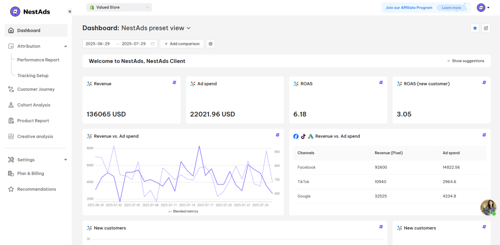
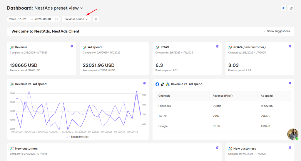
The NestAds preset view is a default dashboard setup that highlights key performance metrics, displaying them in an easy-to-read line chart.
By default, it showcases essential metrics, including:
- Revenue
- Ad Spend
- CPA (Cost per Acquisition)
- ROAS (Return on Ad Spend)
- NC-ROAS (ROAS from New Customer)
- New Customers
Metrics can be reported following settings:
- Date Range (You can set a custom date range as you want)
- Attribution model (Last platform click, First click, Last click and Linear)
- Model date (Report by):
- Event date: The day the customer makes a purchase
- Click date: The day the customer clicks on an ad
- Attribution window ( 1 day, 7 days, 14 days, 30 days, 60 days, and 90 days)
You can customize this view by adding or adjusting metrics to suit your goals or create a custom saved view for tailored reporting.
Note: Metrics with a blended icon indicate combined statistics across all connected channels (TikTok, Google, Facebook, and Klaviyo)
NestAds Custom Saved View
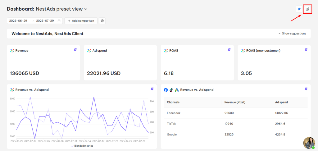
The NestAds Custom Saved View can be created by editing the current view:
- Click on Edit Dashboard icon in the top right corner of the current view
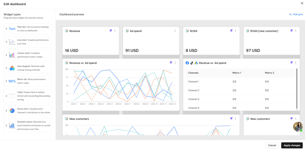
- Inside the Edit Dashboard, there are 2 sections for your configuration:
Widget types: Drag and drop these widgets into the preview canvas on the left side:
- Plain text: Use as a section heading or note on the dashboard
- Line chart: Visualize performance over time
- Column chart: Compare performance metric values
- Venn diagram: Illustrate order overlap among channels
- Metric tile: Show performance metric value
- Table: Present data in tabular format with ascending/descending sorting
- Donut chart: Visualize each channel’s contribution to the whole
- Stacked column: Illustrate how each channel contributes to the overall performance over time
Here are the settings of 4 types of Widget:
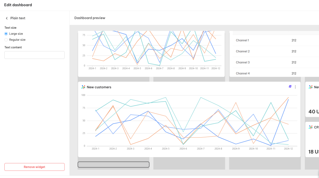
- Text Widget:
- Text Size (Large size or Regular size)
- Text Content
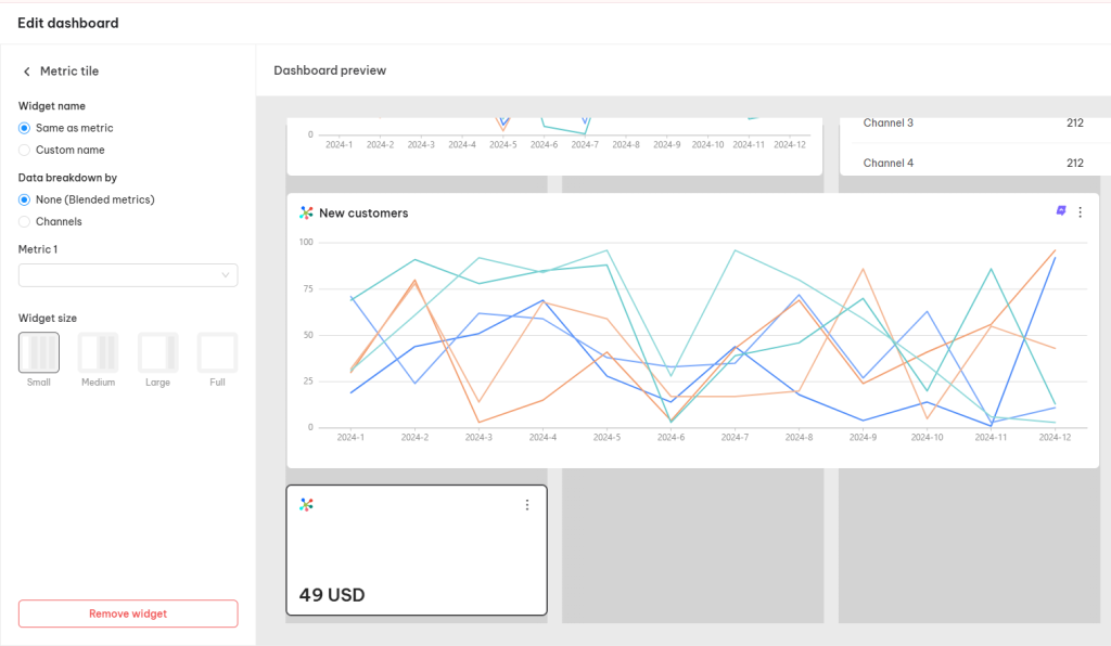
- Metric Tile:
- Widget name (Same as metric or Custom name)
- Data breakdown by (None or Channels)
- Metric (Choose the metric to be reported)
- Widget size (Small, Medium, Large, Full)
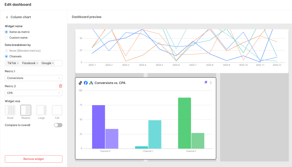
- Chart/Diagram Widget
- Widget name (Same as metric or Custom name)
- Data breakdown by (None or Channels)
- Metric (Choose the metrics to be reported)
- Widget size (Small, Medium, Large, Full)
- Compare to overall (switch to compare the channel metrics and blended metrics)
- Table Widget
- Widget name (Same as metric or Custom name)
- Data breakdown by (None or Channels)
- Metric (Choose the metrics to be reported)
- Widget size (Small, Medium, Large, Full)
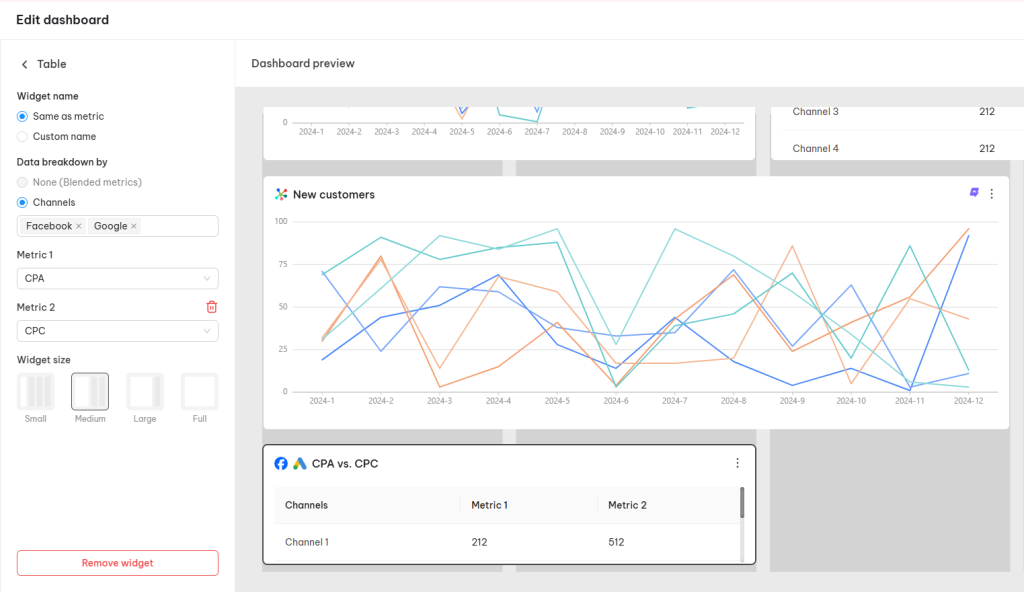
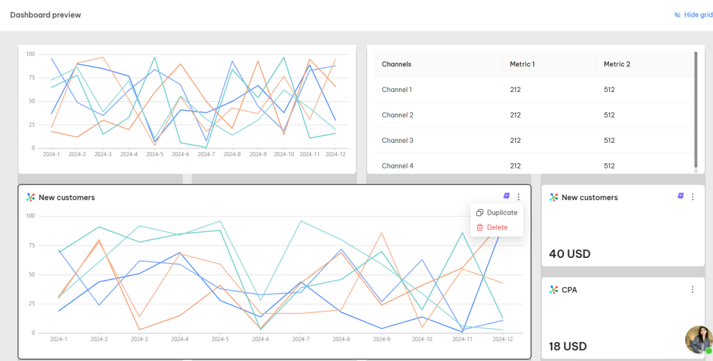
- Dashboard preview: Directly adjust sizes, duplicate, and delete widgets in the preview.
Note: the statistics in the Dashboard preview are illustrative, (accurate statistics are only displayed after applying changes and saving the view)
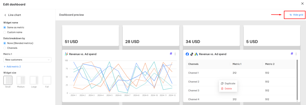
You can hide the grid to have a more focused preview of your performance metrics.
3. After edit your current view, click on Apply changes button
4. The Dashboard displays “Unsaved changes” :
Inside the Dashboard, click on:
- Save: Save the changes you made to this current dashboard
- Save as new view: Save it as a new separate saved view
- Edit view name: Save the changes to the current dashboard with a new view name
- Delete view: Remove the current dashboard
You can set a view as a default view to display automatically when logging into NestAds Dashboard by clicking on the Star Icon in the top right corner:
(The default view is NestAds preset view)
How to Compare Your Metrics Over Time?
The app allows you to compare statistics across different time periods for deeper insights:
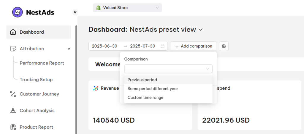
1. Inside the Dashboard, click on (+) Add Comparison button > choose the preferred time:
- Previous period (Compare with the closet previously chosen date range)
- Same period different year (Compare with the same chosen date range in a previous year)
- Custom time range (Compare with a custom chosen date range)
After clicking on Apply, the comparison metrics will be displayed on your metrics:
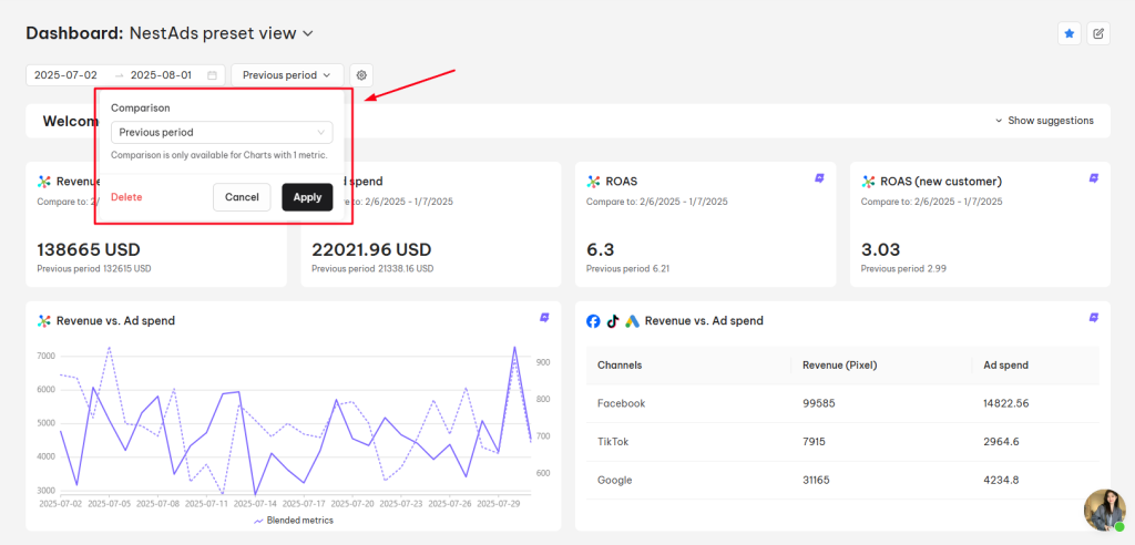
(Comparison is only available for Charts with 1 metric)
You can change the comparison period or delete the comparison view by clicking on the (+) Add Comparison button > Delete or Change the period > Apply to save the changes.
Need any help?
Feel free to contact us via live chat or email at [email protected]. Our support team is happy to assist you!
 NestAffiliate
  NestDesk
  NestScale Bundles & Discounts
  NestScale Product Variants
  NestSend
  NestWidget