 NestAffiliate
  NestDesk
  NestScale Product Variants
 Cohort analysis is essential for tracking customer behavior over time, making informed business decisions, and identifying high-value customer segments to maximize retention and revenue.
By examining cohorts, you can better understand how much revenue a customer brings over time and estimate when your Customer Acquisition Cost (CAC) will break even.
In this article, you will learn how to use Cohort Analysis feature in NestAds. Let’s get started.
Overview of Cohort Analysis
A cohort is a group of people who share a common characteristic, often tied to a specific time frame (e.g., when they made their first purchase).
Cohort analysis allows you to segment your customers into these groups and track how their engagement and purchasing behavior evolve. A common practice is to form cohorts based on customers’ first purchase date, enabling you to monitor their journey from acquisition to retention.
Why Cohort Analysis Matters
This approach provides insights that can improve key business metrics like LTV and retention rate. It can help answer crucial questions such as:
- When do customers tend to churn?
- What percentage of your revenue comes from new vs. returning customers?
- When is the optimal time to re-engage lapsed customers?
How to set up Cohort Analysis table
The Cohort Analysis report groups customers by the period they made their first purchase (daily, weekly, or monthly) and measures key metrics afterward.
You can then measure key metrics (e.g., number of new customers, RPR, total sales from new customers) per time frame after the cohort’s first order.
Configuration
Step 1: Configure the Analysis Table
Set up these key parameters to customize your report:
- Metrics Selection: Choose the metrics to be displayed in the table.
- Date Interval: Select between Day, Week, or Month to define your cohort time frame.
- Count Rule: Decide how purchases are counted:
- Count 1st repurchase only
- Count every purchase.
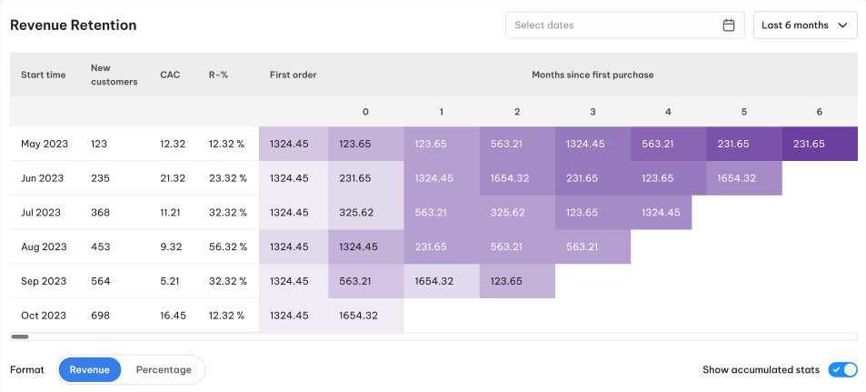
- Accumulated Data: Enable viewing of cumulative metrics across periods.
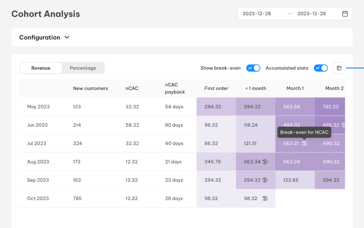
- Break-Even Notice: Add a marker to indicate when CAC has been fully recovered.
Click Apply to save your settings, then set a specific time range using the Time Picker.
Note: If the date interval is set to “Day,” select a time range of fewer than 14 days for better accuracy.
Step 2: Customize the Displayed Metrics
To enhance the analysis, click the icon in the top-right corner of the table to select which metrics you want to showcase:
- New Customers: The number of customers making their first purchase in each cohort.
- RPR (Repurchase Rate): The percentage of customers making additional purchases after their first order.
- Total Revenue: Revenue generated from all orders in that cohort.
- nCAC (New Customer Acquisition Cost): The cost to acquire a new customer within that cohort.
- nCAC Payback Period: The number of days until accumulated revenue equals total acquisition costs.
Analyzing Cohorts: Tips and Best Practices
Once your Cohort Analysis table is configured, here are ways to extract valuable insights:
Horizontal Analysis: Understanding a Single Cohort’s Lifecycle
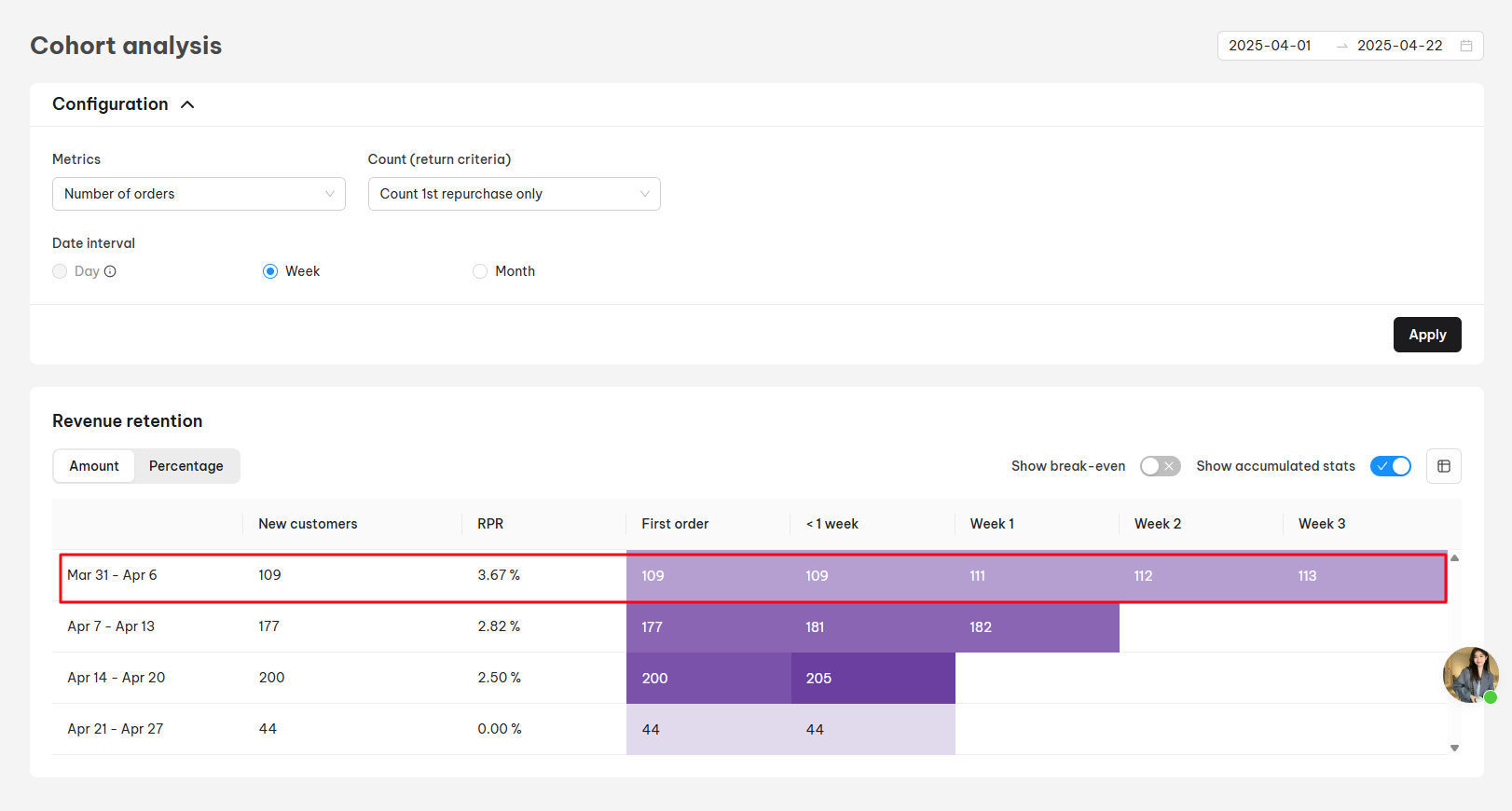
This analysis shows how a single cohort behaves over time. For example, if analyzing customers who first purchased in the time range from Mar 31 to Apr 6, the table displays:
- New Customers: Total new customers in the cohort.
- RPR (Repurchase Rate): Percentage of returning customers.
- First order: The metric value for the 1st order
- The remaining cells in the row show us how the estimated LTV of a customer in the cohort has increased month by month since the first order, impacted by members of the cohort who have returned to your store to make additional orders.
Each row represents the evolution of this cohort’s spending behavior, helping you understand how LTV develops.
The format could be shown as numbers or percentages.
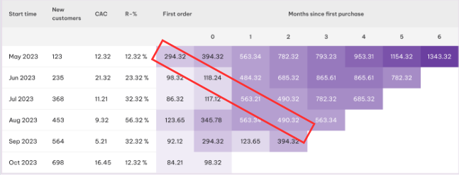
Diagonal Analysis: Tracking Seasonal Trends
Diagonal analysis is useful for spotting trends during key sales periods, such as Black Friday or holiday campaigns.
The diagonal analysis allows you to track a specific cohort’s spending behavior over time. For instance, starting with the ‘First Order’ amount for the May 2023 cohort and moving diagonally down and to the right, you can observe that cohort’s average spending in the first, second, and subsequent months after their initial purchase.
Analyzing multiple Cohorts
Another interesting analysis is how cohorts are compared to one another – comparing 2 or many cohorts can give insights into the behaviors of your customers.
For example, if we compare the May and June cohorts we immediately see that many more new customers came in June than in May and that their repurchase rate is higher.
It’s interesting to analyze and understand what impacts this difference:
- How are we targeting customers in each cohort?
- Were customers in the June cohort promoted with a specific campaign?
- Are customers in the June cohort using a specific discount code?
- Which product categories are contributing least to the increase in new customers and the repurchase rate?
In summary, the horizontal analysis provides a snapshot of a single cohort’s lifecycle, the vertical analysis compares cohorts at similar lifecycle stages, and the diagonal analysis tracks a single cohort’s progression over time.
Color Coding: Visualizing Trends at a Glance
To simplify data interpretation, the Cohort Analysis table uses color coding based on NestAds’ signature purple palette.
The gradient reflects fluctuations in metric values, making it easy to identify high-performance areas or potential issues, such as declining repurchase rates.
Once an interesting period has been identified – you can further investigate the data by customizing the cohorts table.
Need more support?
If you need any help, feel free to contact us via live chat in-app or email at [email protected]. Our support team is happy to assist.