 NestAds
  NestAffiliate
  NestDesk
  NestScale Bundles & Discounts
  NestScale Creative Analysis
  NestSend
  NestWidget
  NS Estimated Delivery Date
  NS Order Printer PDF Invoice
  NS TikTok Pixel Event Tracking
 With NestScale Product Variant app, you have full control over the design of your variant options on the collection page. Adjust the variant size, border color, hover effects, and more to make your variants both stylish and perfectly aligned with your store theme.
In this guide, you will learn how to customize the swatch display on your collection page. Let’s get started!
How to Customize the Swatch Display on Your Collection Page
- Access the App
- Navigate to Design Settings
- Click on the “Collection Page” Tab
All variant styles selected in Option Configuration will be marked with an “In Use” label.
To make edits, simply click the Customize button next to the selected swatch display style.
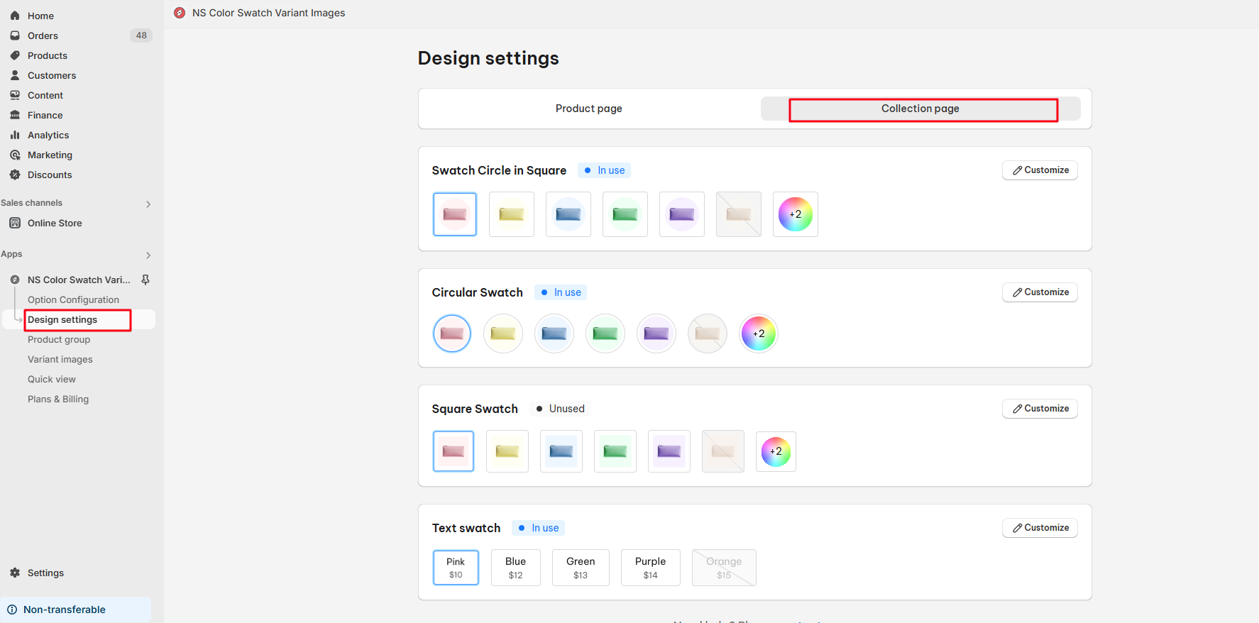
Each style lets you personalize various sections to fit your store’s design.
To revert back to the default settings, click Reset Settings to Default.
Following is how to customize 2 main variant styles:
- Image swatch
- Text swatch
1. Image Swatches Customization
Image swatches can be applied to the following styles:
- Swatch Circle in Square
- Circular Swatch
- Square Swatch
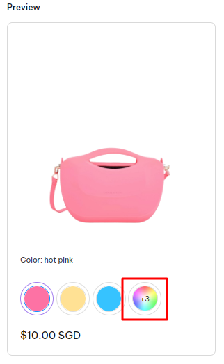
Limited swatch display
This feature displays a limited number of variants with an illustration image or text, encouraging customers to click through to the product detail page to view all available variants.
In this section, you can configure:
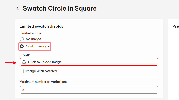
- Limited image
- No image: Display a default image.
- Custom: Upload a specific image from your desktop.
In Custom Option, please upload an image for your limited swatch option from the desktop’s file.
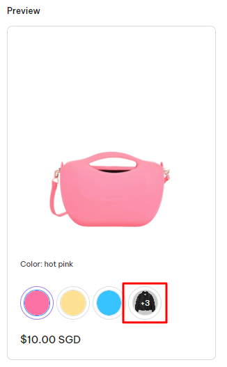
Note: You can activate the Image with overlay button to create a dark overlay for the limited swatch as below:
- Maximum number of swatches
Set the number of variants to display beneath each product on the collection page by entering your preferred number.
General settings
Here, you can customize swatch names, spacing, and image settings:
- Swatch name
- Label size: Adjust by entering your preferred number.
- Case: Choose from Default, Uppercase, or Lowercase
- Spacing settings
- Swatch Spacing: Adjust the space between swatches.
- Border Spacing: Set the space around the swatch border.
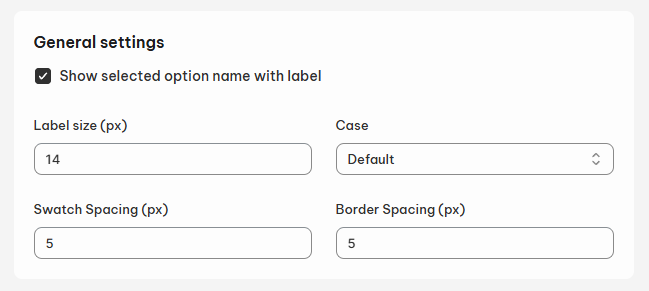
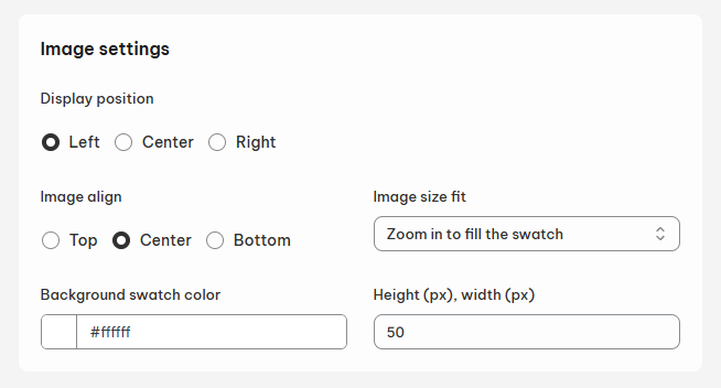
Image settings
- Display position: Place the swatch on the left, right, or center of the collection card
- Image align: Crop the image from the top, bottom, or center.
- Image size fit
- Cover (zoom in to fill the swatch)
- Container (zoom out to fill the swatch)
- Background swatch color: Enter a custom hex color code.
- Height, width size: Adjust as needed.
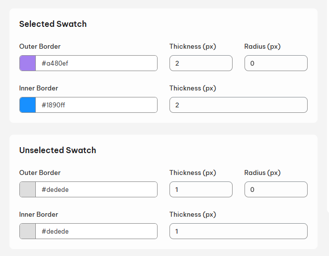
Selected Swatch
- Outer Border
- Enter outer border color
- Thickness
- Inner Border
- Enter inner border color
- Thickness
Unselected Swatch
- Outer Border
- Enter outer border color
- Thickness
- Inner Border
- Enter inner border color
- Thickness
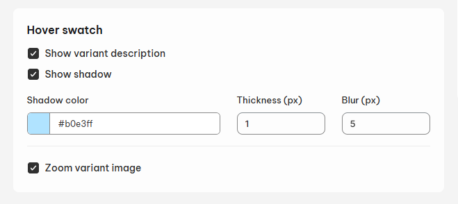
Hover swatch
Choose how your swatch behaves when hovered over:
- Show Variant Description
- Show Shadow (Color, Thickness, Blur)
- Tooltip with Variant Image
- Zoom Variant Image (ON/OFF toggle)
2. Text Swatches Customization
Limited swatch display
This works the same way as for image swatches, encouraging users to view full variant options on the product detail page.
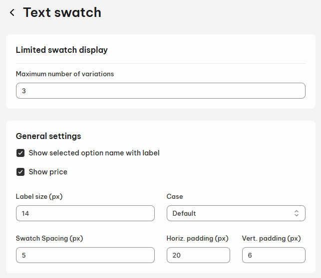
- Maximum number of swatches
Set the maximum number of swatches to display under each product on collection page by entering a number.
General settings
Customize how the swatch name appears:
- Swatch name
- Label Size: Adjust the font size.
- Case: Select Default, Uppercase, or Lowercase.
- Spacing Settings
- Swatch Spacing: Set the distance between two swatches.
- Horizontal & Vertical Padding: Adjust padding as needed.
Note:
- You can hide the Option Label by turning off the Show selected option name with label button
- Hit on the Show price button to display the variant prices inside the Text swatches
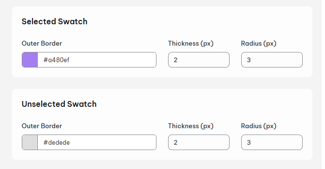
Selected Swatch
- Outer Border
- Outer border color
- Thickness
- Radius: Where you rounded the outer border
Unselected Swatch
- Outer Border
- Outer border color
- Thickness
- Radius: Where you rounded the outer border
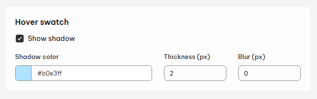
Hover swatch
- Show shadow
- Shadow
- Thickness
- Blur
Real-Time Preview
While editing, you can see all changes in real-time using the Preview feature on the right-hand side of the page.
When you’re satisfied, don’t forget to Save your changes to update your newly customized swatches!
Need any help?
Please contact our support team via live chat or email at [email protected]. We are happy to help you as soon as possible!